
Have you ever been captivated by a fashion photograph, not just by the clothes or the model, but by the entire mood and atmosphere it creates? That’s the magic of color! In fashion photography, color correction is more than just fixing imperfections; it’s an art form that elevates the image, telling a story and conveying emotions through its rich hues and subtle tones.
We are going to explore the essential techniques and tips for achieving stunning color correction results in fashion photography. Whether you’re a seasoned professional or just starting out, mastering color correction will transform your images, taking them from good to breathtaking.
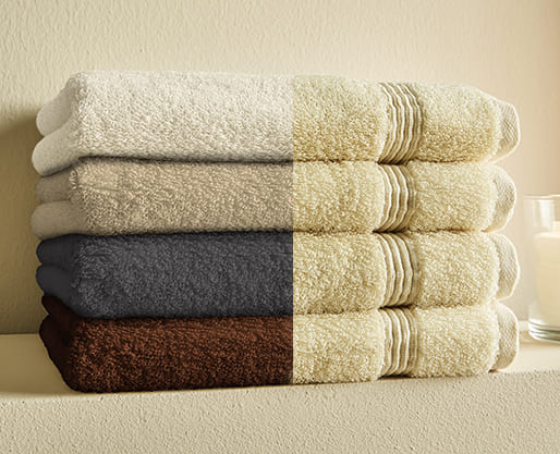
Understanding the Role of Color in Fashion Photography
Color is like a silent language in fashion photography. It sets the mood, evokes emotions, and creates a visual impact that lingers long after the viewer has turned the page. A vibrant red dress can exude confidence and passion, while a soft and calming blue conveys serenity and elegance.
Think of iconic fashion photographs like Richard Avedon’s black and white portraits that capture timeless beauty or Helmut Newton’s bold use of color to create a sense of drama and intrigue. Color is a powerful tool that, when used effectively, can elevate your fashion photography to new heights.
Preparing for Color Correction: Best Practices
The journey to stunning color correction starts long before you hit the “edit” button. Planning and preparation are key to achieving the desired color palette in your final image. Here are some best practices to consider:
- Lighting: Proper lighting is crucial for capturing accurate colors. Opt for natural light whenever possible or use studio lighting that allows for precise control over color temperature.
- Backdrop selection: The background plays a significant role in the overall color harmony of your image. Choose a backdrop that complements the clothing and doesn’t clash with your desired color palette.
- Styling: Collaboration with stylists and makeup artists is essential, especially when working with specific brand colors or themes. Ensure all elements, from clothing to makeup, work cohesively within your color scheme.
- Capturing in RAW: Shooting in RAW format preserves more color data compared to JPEG, giving you greater flexibility and control during the editing process.
By implementing these best practices, you’ll be setting yourself up for success in the color correction stage.
Color Correction Workflow for Fashion Photography
Now, let’s dive into the exciting world of color correction! Here’s a step-by-step guide to get you started:
- Import your images: Choose your favorite editing software, whether it’s Adobe Photoshop Lightroom Classic, or a similar program.
- Basic adjustments: Start with white balance adjustments to ensure accurate color representation. You can then adjust exposure, contrast, and shadows/highlights for a well-balanced foundation.
- Selective adjustments: This is where the magic happens! Use tools like curves, selective color, and HSL (hue, saturation, lightness) adjustments to fine-tune specific colors. Enhance skin tones, make clothing colors pop, and adjust the background elements while maintaining a natural and realistic look.
Techniques for Achieving Vibrant and Cohesive Colors
Want to create truly captivating visuals? Here are some techniques to take your color correction to the next level:
- Color grading: Use color grading to add a specific mood or style to your image. Play with warmth, coolness, and split toning to create unique and impactful visuals.
- Color harmony: Achieve balance and visual interest by using complementary or analogous color schemes. Consider the color wheel and experiment to find pleasing color combinations.
- Fine-tuning individual colors: Don’t be afraid to get specific! Use tools like split toning and selective color adjustments to target specific color channels and enhance specific hues within your image.
Addressing Common Color Correction Challenges
Even the most experienced photographers face challenges during color correction. Here are some common issues and how to tackle them:
- Color casts: Unwanted color casts can be caused by various factors like artificial lighting or fluorescent bulbs. Use white balance adjustments and selective color correction to neutralize the unwanted hues.
- Uneven lighting: Uneven lighting can create inconsistencies in color tones. Use tools like dodge and burn or luminosity masks to selectively adjust brightness and shadows for a more balanced look.
- Skin tone inconsistencies: Achieving natural and pleasing skin tones is crucial in fashion photography. Use selective adjustments and targeted color correction tools to even out skin tones while preserving natural details and textures.
Advanced Color Grading Techniques
For those looking to push boundaries and experiment further, there’s a world of advanced color grading techniques to explore:
- Creating custom color presets: Develop your own signature style by creating custom color presets that you can apply consistently across multiple images.
- Creative color grading: Explore various color grading styles, from subtle and natural to bold and dramatic, to add a unique
- Exploring Diverse Color Grading Styles: Experiment with different color grading styles to find what resonates with your vision and brand identity. Here are some popular approaches:
- Natural and Subtle: Preserve the natural color palette while enhancing vibrancy and contrast for a timeless look.
- Warm and Inviting: Introduce subtle warm tones to create a sense of comfort and elegance.
- Cool and Edgy: Utilize cooler tones and increased contrast for a contemporary and sophisticated feel.
- High-Fashion Drama: Push the boundaries with bold color choices and dramatic contrasts for a statement-making impact.
Maintaining Brand Consistency in Color Correction
For fashion brands and publications, consistent color correction is paramount in maintaining a recognizable brand identity.
1. Defining Your Brand Palette:
Establish a cohesive color palette that aligns with your brand’s overall aesthetic and messaging. This palette will serve as the foundation for all your color correction decisions.
2. Establishing Color Correction Guidelines:
Develop clear and concise color correction guidelines for your team or collaborators. These guidelines should outline the desired color temperature, saturation levels, and any specific adjustments needed to achieve brand consistency.
3. Leveraging Professional Help:
For brands with high-volume photo editing needs, partnering with a professional photo editing service like bZm Graphics can ensure consistent and high-quality results. Their team of experienced editors can follow your brand guidelines and deliver flawlessly edited images that seamlessly reflect your brand identity.
Conclusion
By mastering color correction, you unlock the power to transform your fashion photography from ordinary to extraordinary. Remember, color is a powerful storytelling tool. Use it strategically to enhance the style and elegance of your images, strengthen brand identity, and captivate your audience. So, grab your editing tools, unleash your creativity, and start crafting visually stunning fashion photography that leaves a lasting impression.